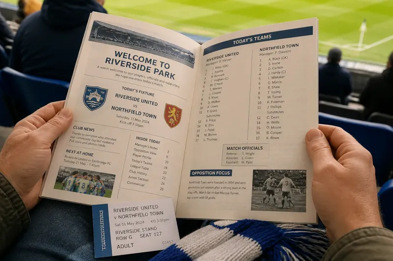
The Myth of the One True Club Colour
Club colours can shift across eras and settings. Learn to read a team’s full visual identity through kits, badges, local materials and matchday context.
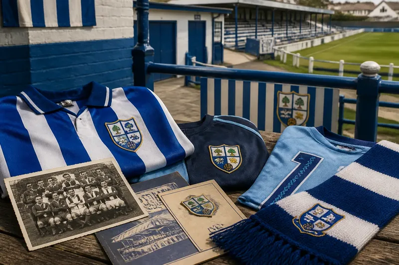
Which color is the club’s real one? Ask around a ground and you may hear the answer in a shirt, a badge, a nickname, or the paint on a clubhouse door. Club colors are often less like a single swatch and more like a family resemblance: recurring shades and symbols that change with their setting.
Start with the shirt
A team’s familiar home kit is an obvious place to look, but it is only one moment in a club’s visual life. A shirt’s colors can be shaped by practical choices, such as available fabric, visibility against an opponent, or a sponsor’s design, as well as by tradition.
Look closely at the details rather than relying on a broad label like “blue.” Navy, royal blue, and pale blue read differently beside white trim, a dark collar, or a contrasting number. The combination may be the recognizable part, even if the exact shade moves around.
For a useful comparison, look at a current shirt beside an older team photograph or a preserved kit in a club display. Notice which elements persist: perhaps a stripe, a colored sleeve, or a particular pairing. Treat the image as a clue, not a ruling on what the club must always wear.
Read the badge separately
A crest can hold colors that rarely dominate the playing kit. A town emblem might include green leaves, a gold field, or a red detail, while the team’s regular shirt uses a quieter combination. Those badge colors still belong to the club’s visual identity, even when they are not the first shades a supporter names.
Badges also appear in different forms. A detailed crest on a printed program may be simplified for embroidery or reduced to a single color on training wear. When comparing versions, notice what survives the change: the outline, initials, local symbol, or arrangement of shapes.
Say you find an old club photograph in which the players wear dark shirts, while a later badge uses a bright accent. If you compare both with a current scarf, you might see the accent echoed in its border. That pattern suggests a visual relationship across objects, not one timeless uniform shade.
Watch colors change jobs
A club may use one palette for its home shirt, another for an away strip, and a third for warm-up clothing. These choices serve different purposes. A contrasting away kit can help distinguish teams on the field, while training gear may follow a sponsor’s or supplier’s design language.
Context changes how a color reads, too. Under a cloudy sky, a bright shirt can stand out; beneath indoor lights, a darker trim may become more noticeable. In a crowded stand, a block of the same color can create a shared visual impression that no single garment carries by itself.
It helps to think of club colors as paint in a shared tin: the ingredients matter, but the surface and the mix affect what you see. A stadium banner, a goalkeeper’s shirt, and a printed badge can all use familiar colors without looking identical.
Follow the local setting
Club colors often acquire meaning through their surroundings. A shade may echo a local flag, a school uniform, a nearby landscape, or a longstanding neighborhood association. That connection may be obvious to regulars and invisible to someone seeing the kit for the first time.
Look around the ground for how colors travel beyond official merchandise. They may appear on painted railings, a hand-lettered sign, or a community team’s borrowed shirts. Those uses do not necessarily follow a formal style guide, yet they can show which combinations people recognize and choose to keep visible.
Local practice can also vary by group. A youth side, women’s team, or supporters’ branch may adapt a club palette to its own clothing or banner. The difference need not mean a break with tradition; it can be another way the tradition is used.
What do club colors mean?
Why do club colors change?
Colors can shift when a club updates its kit, badge, sponsor presentation, or playing strip for a particular match. Sometimes the underlying pairing remains, while the shade, placement, or trim changes with the design.
Does the badge define the official colors?
The badge is an important reference, but it may contain more colors than the team regularly wears. A club’s public identity can also include kit combinations, nickname imagery, and colors used around its ground.
How can I identify an older kit’s colors?
Use more than a faded photograph if you can: compare it with a surviving shirt, a club archive image, or a contemporaneous program. Old prints and screens can distort shades, so look for recurring contrasts and patterns as well as precise color names.
Build a fuller picture
If you are trying to understand a club’s palette, collect evidence from several kinds of object rather than choosing a favorite and calling it definitive. A compact set of observations can make the picture clearer:
- Home kit: Note the main color, trim, and stripe or panel pattern.
- Away kit: See which colors recur and which appear only for contrast.
- Badge: Separate the crest’s full palette from the colors most often worn.
- Printed material: Compare a program or poster with a photographed garment.
- Ground details: Notice colors on signs, railings, and community displays.
- Local symbols: Look for a town or neighborhood motif that may explain a color choice.
When sources disagree, describe the setting instead of forcing a final verdict: “the familiar home-shirt pairing” is more precise than claiming that every object must follow one scheme. For a historical identification, a club archive or knowledgeable local supporter may help distinguish an intentional design change from a faded image.
Club colors are easiest to understand when you follow them from cloth to crest to ground and back again. The next time someone names a team by one shade, look for the companion color, the badge detail, and the place where they appear; that small pause often reveals the club’s richer visual identity.